

Maps are complicated things.
They're supposed to give information and bring perspective; but depending on its creator's motives, those perspectives can be problematic.
Aboriginal and Torres Strait cultures use bark paintings, sand sculptures and rock art to feature geographical information.
Spears can be incised with the location of wells and rock holes, each with a memorised name; shells carved into the likeness of islands.
But with the arrival of colonists to these shores, maps became tools of invasion and conquest, eventually resulting in the modern division of the continent
A landmass the size of Europe being reduced to the tic-tac-toe separation of eight states and territories is almost comically simple compared to the hundreds of Aboriginal and Torres Strait Islander groups (political, cultural, linguistic) that exist here.
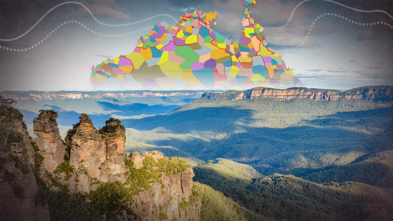
The Australian Institute of Aboriginal and Torres Strait Islander Studies (AIATSIS) map aims to counter that; its multicoloured patchwork gives a clearer picture of the diversity of Blak societies.
It's well known to us now, but where did the map come from? And is it still fit for purpose?
The Encyclopaedia of Aboriginal Australia
To talk about the map, first we have to mention the book it originally came with.
The AIATSIS map was created for inclusion in the Encyclopaedia of Aboriginal Australia, a mammoth project by AIATSIS that attempted to bring together the existing scholarship on Indigenous cultures across the continent.
Work on the encyclopaedia, led by biologist and archaelogist David Horton, began in the late eighties.
It was finally published by Aboriginal Studies Press, the publishing arm of AIATSIS, in 1996.
Growing scholarship and an increased awareness of the depth of Indigenous knowledge systems has seen an explosion in resources since then: the encyclopaedia is now out of date and rarely used.
But the map, with some small alterations, continues to be widely used.
The Tindale Map
As with the encyclopaedia as a whole, Horton and his team deeply researched the map: academic papers, land claim reports, land rights acts from the NT and South Australia, and other historical documents stretching back to the time of colonisation all contributed to the map's creation.
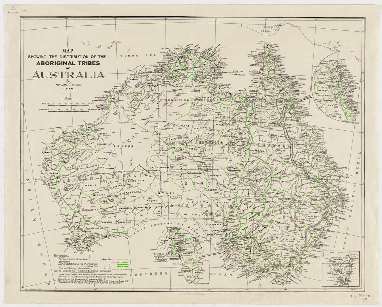
One notable source of research was an earlier map of the continent created by anthropologist Norman Tindale.
In the early 20th century, Tindale was instrumental in upending the racist colonial assumption that all Aboriginal groups were nomadic, which contributed to the lie of terra nullius.
His observations led him instead to a truth known to the cultures that have lived here for millennia: that ties to place are central to Aboriginal and Torres Strait Islander existence.
Though the methods he used to create his map are now out of date, it proved a valuable resource for the AIATSIS map.
What do the map's colours represent?
We're all familiar now with the colourful patchwork of the AIATSIS map.
But the divisions those colours represent are not so simple as western colonial maps, whose hard lines depict political jurisdictions and little more.
Instead, the map tries to give an idea of the richness and complexity of the overlapping ties to places, and between peoples, that were developed over millennia.
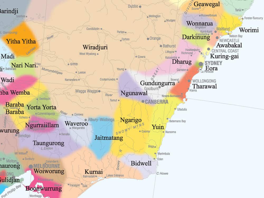
Each patch represents a larger grouping of people. It might be a social group, or a language group, or indeed a nation. Within that patch can be smaller groups, of clans or dialects.
It differs across the map.
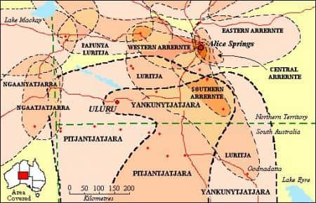
Take language for example: the Pitjantjatjara, Yankuntjatjara, Ngaanyatjarra and Luritja peoples of the Central Desert are each marked in different colours on the map.
Their dialects, however, are mutually intelligible, much as different English-speaking countries may understand each other.
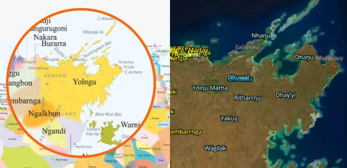
Conversely, the many clans of the Yolngu in the Top End of the Northern Territory speak multiple different languages, not all of which can be understood by one another (to be an adult in Arnhem land is to be a polyglot!).
However the speakers of those different languages share a deep connection through social, cultural and ceremonial ties, hence why on the AIATSIS map, they are depicted with one colour, and simply as the Yolngu.
The reality is that the map could never accurately depict the complexity of the moieties and clans that belong to the land there, and in this case makes do with the simplified representation.
The colour groupings also don't have hard borders. If you look closely, you'll see that each patch has a soft border that blends into the surrounding ones.
Say a significant site, such as a waterholem, marks the western border of someone's Country; if you head further west you meet the eastern border of the neighbouring Country. What about the space in between?
There may be a negotiation of the differing authority over that land, again a reflection of the complex ties to place.
Family groups play an important role as well: one Warlpiri family might have a stronger claim to areas in the north of their Country; another Warlpiri family might have claims to the south.
Is the map still fit for purpose?
There have been suggestions to update the map over the years, but for now it remains the same as it did in 1996.
The choice to represent all these connections between lands and peoples in the way the map does is exactly that: a choice.
The reality is that there a many layers of ties that could be depicted; language, clans, kinship, even dance styles.
It has been suggested a digital version could attempt to show these different layers, one atop another.
But only the lived experience of Aboriginal and Torres Strait Islander peoples can give a complete picture of those layers; only the deep knowledge held by those cultures can paint the true map of this continent.
