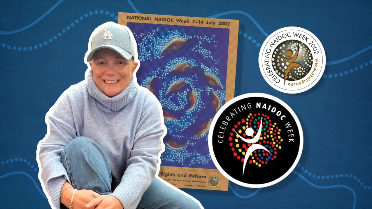
It's one of the most recognisable logos in Australia - the NAIDOC Week logo.
As the official visual identity of NAIDOC Week, it appears on posters, banners, merchandise, school resources, buildings, trams, buses and even on biscuits and cupcakes across the country every July.
Yet while the logo is instantly familiar, the story of how it came to be has remained untold.
The original NAIDOC logo was created in 2002, when NAIDOC Week was administered by the Aboriginal and Torres Strait Islander Commission (ATSIC).
ATSIC had become the principal organisation responsible for producing and distributing NAIDOC Week promotional materials in the early 1990s, taking over from the network of state and territory based committees.
These resources were used by schools, universities, pre-schools, kindergartens, health centres, libraries, local councils, government departments, private companies and even Australian diplomatic missions overseas.
Interest in celebrating NAIDOC Week was reaching new levels.
When I was a Public Affairs Officer in ATSIC's Communications Branch, I began the push for a dedicated NAIDOC logo.
I believed there was a need for a strong, enduring visual identity, and proposed creating a logo to feature on a new range of NAIDOC promotional materials, beginning with lapel stickers.
In May 2002, I turned to Jo Blanchard - ATSIC's in-house graphic designer - to design the new NAIDOC logo.
Blanchard had already designed a huge range of ATSIC’s publications, reports and promotional collateral.
Reflecting on her design today, Blanchard said she wanted the new logo to be easily recognisable - simple, versatile and timeless.
She also felt it needed to stand out alongside the incredible artwork submitted for the annual NAIDOC poster competition, while also being strong enough to stand alone as a recognisable symbol of NAIDOC.
Blanchard’s original logo contained some 120 dots - all the same shape but replicated at different sizes and each slightly rotated to make the design less uniform and formal.
“The dots represent the colours of the Aboriginal and Torres Strait Islander flags, celebrating connection, culture and community and the boomerangs symbolise people coming together,” she said.
“I'm incredibly proud that, all these years later, the logo is still being used and has truly stood the test of time,” she added.
In 2002, ATSIC distributed around 250,000 round NAIDOC Week lapel stickers featuring Blanchard’s new design.
The logo also appeared on the official NAIDOC Week poster for the first time.
That year also saw a huge interest for promotional and information material for NAIDOC week with ATSIC distributing some 100,000 NAIDOC posters, 150,000 postcard-size NAIDOC poster stickers, 200,000 Indigenous Australians bookmarks and more than 1,000 colouring-in kits.
In the lead up to NAIDOC week, ATSIC’s Website received 1.2 million hits - the second-highest monthly level ever recorded and unheard-of numbers for a government agency.
In 2007, the NAIDOC logo was updated with the bold colour palette that has since become synonymous with NAIDOC Week.
Following the abolition of ATSIC in 2005, responsibility for administering NAIDOC Week moved to the Commonwealth’s Indigenous Affairs portfolio.
Administration has since sat within the Department of Immigration and Multicultural Affairs and Indigenous Affairs (2004–2007), the Department of Families, Community Services and Indigenous Affairs (2007–2013), the Department of the Prime Minister and Cabinet (2013–2019), and is now managed by the National Indigenous Australians Agency (NIAA).
Steve Satour, National NAIDOC’s current Co-Chair says the logo has endured because it captures something timeless.
"Few logos in Australia carry the emotional weight of the NAIDOC Week logo.”
“Every year it becomes a rallying point for celebration, reflection and recognition, reminding the nation of the enduring cultures of the world's oldest continuing civilisations," he said.
More than two decades after its creation, Blanchard’s NAIDOC Week logo remains one of Australia's most enduring and recognisable Indigenous symbols, representing a nationwide celebration of the histories, cultures and achievements of Aboriginal and Torres Strait Islander peoples.
A simple yet powerful design, it speaks volumes - capturing resilience, identity, unity and pride in a single, enduring emblem.